


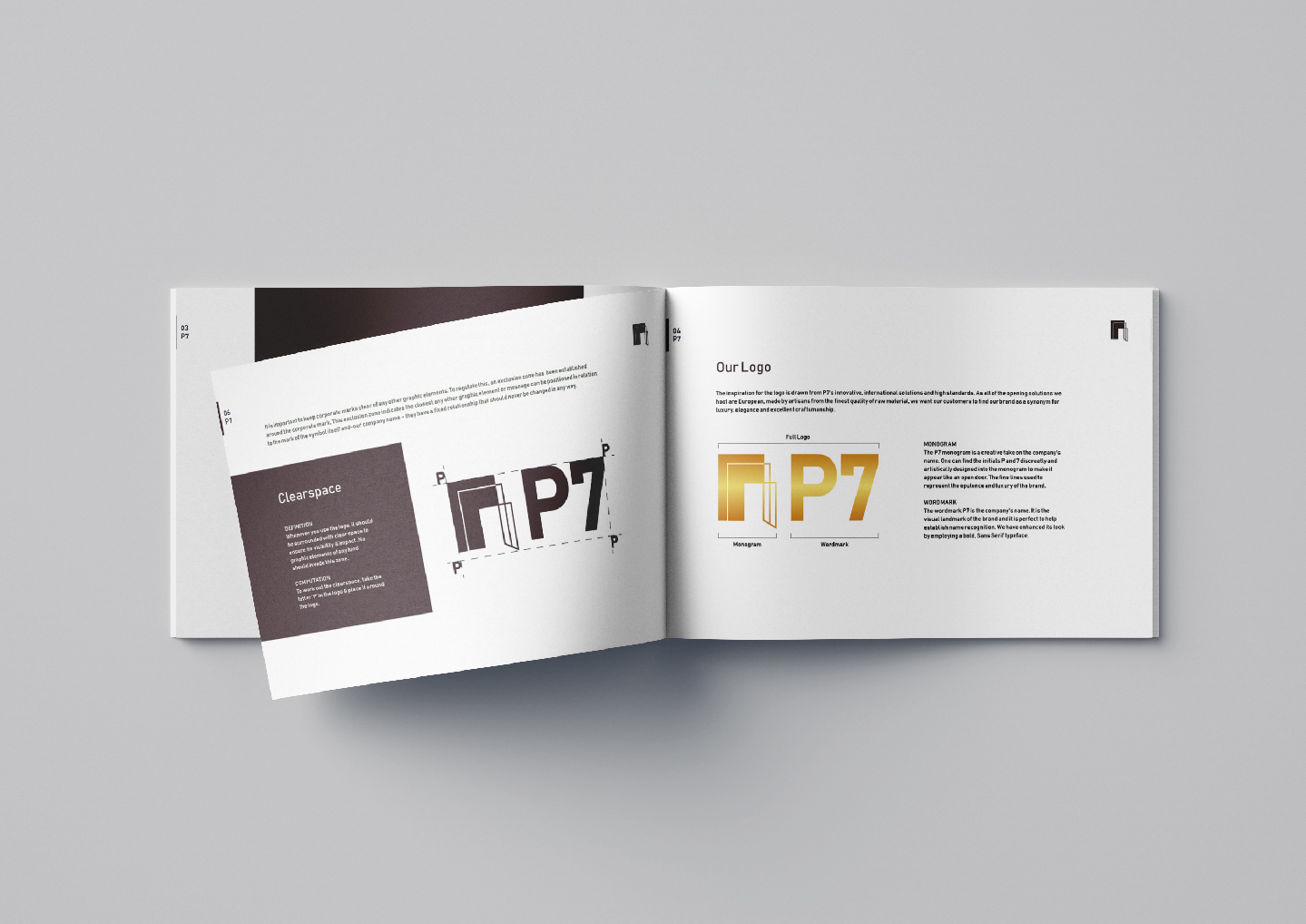
The P7 corporate logo is a combination of a monogram and a wordmark. The logo was designed to house both these elements to reiterate the importance of our company’s image and our solution, which is its name and innovative door solutions respectively. The monogram and wordmark merge perfectly and seamlessly with each other and exude the true essence of the brand impeccably.
The corporate logo is designed by employing the corporate colour- Gold. Gold is the colour of luxury and quality, prestige and sophistication, value and elegance. This shade was deliberately chosen for these unique personalities, which mirror to that of the personality of P7.
The brand manual for P7 was designed to showcase the guidelines needed to use the logo correctly wherever it was incorporated. It gives a short background about the brand, the inspiration behind the logo, the colours used in the logo and the kind of logo it is. It also has a detailed yet simple description of the do’s and don’ts while incorporating the logo. This includes the right shade of colour, the size of the logo and the texts, the variations allowed, etc.
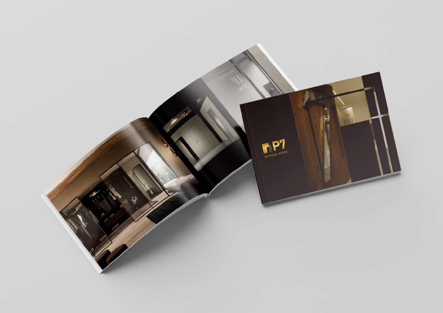
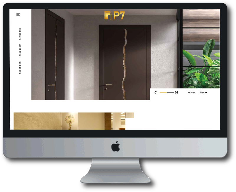
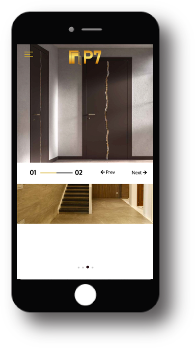
The clientele of P7 wanted a virtual copy of the different brands that are housed under P7. We at Tablo Noir were tasked to create a digital brochure which showcases everything and more that P7 has to offer. The design aesthetics coupled with descriptive content would enthrall the senses bringing in more customers to their store.
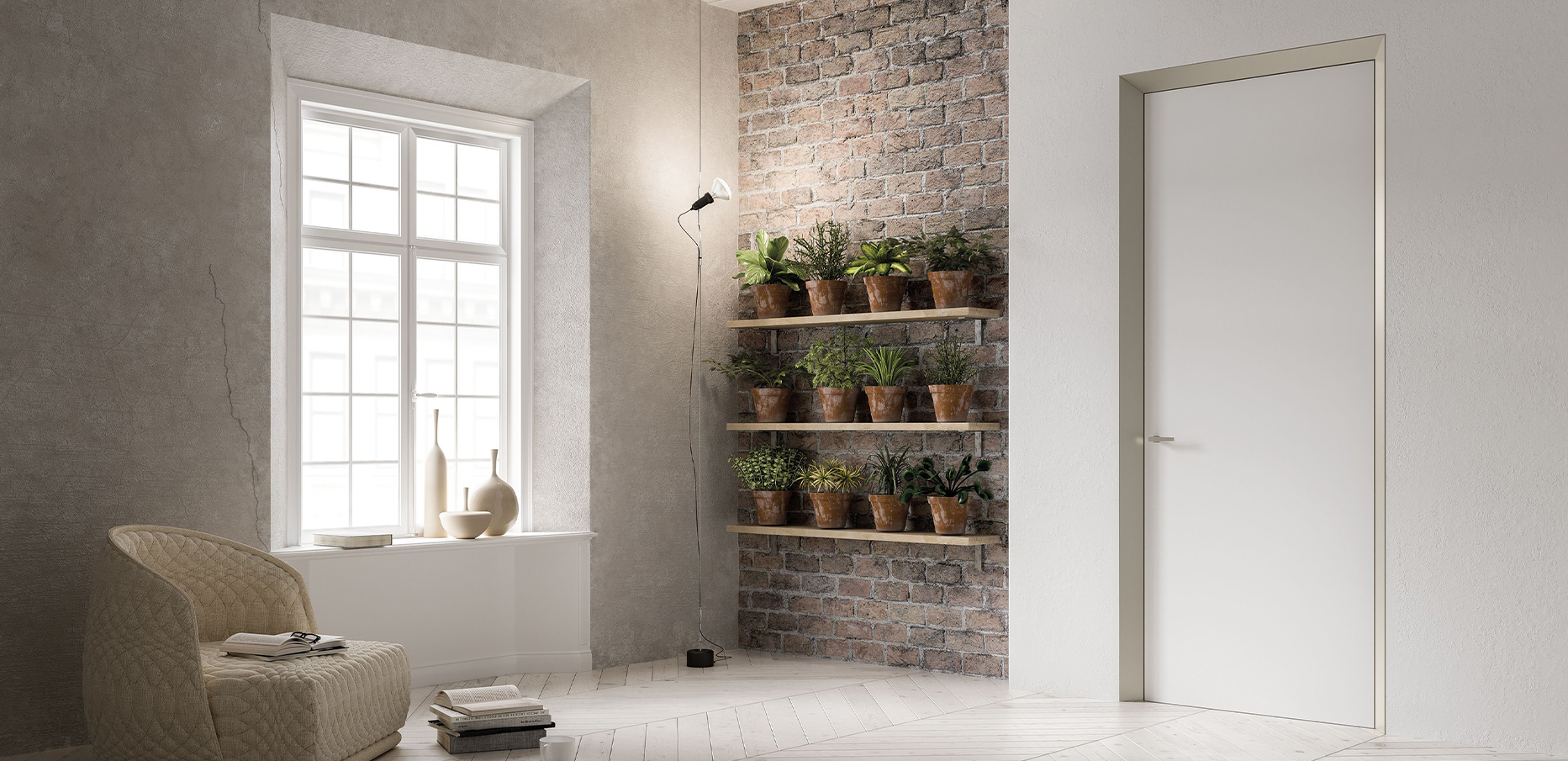
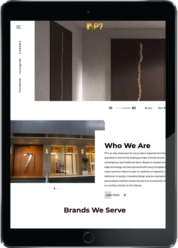
As all of the door solutions they host are European, made by artisans from the finest quality of raw materials, we wanted P7’s customers to find their brand as a synonym for luxury, elegance and excellent craftsmanship and therefore kept this in the forefront while designing and developing the website. The website gave an introduction about P7, their unique selling point, a detailed description of the brands P7 hosts and their certifications. The colours black, white and gold were used elegantly through the site to give it a royal and graceful finish. The developers did a brilliant job of presenting a smooth site with elegant animations from start to finish! The client was completely thrilled to finally have not just a web presence but a brilliant one at that!
The digital marketing for P7 was done to draw more traction to the brand in the ocean that Google is. Our digital marketing team worked on and employed new strategies and plans to ensure P7 had good visibility online. They ensured that when the right keywords were typed in, P7 would pop up as one of the best brands out there in India for luxury opening systems. This also helped P7 climb the SERPs ladder making digital marketing for them a success!
Address
Tablo Noir Pvt. Ltd.
2C, Crystal Lawn, 20, Haddow’s Road,
1st St, Nungambakkam,
Chennai- 600006, Tamil Nadu.
