


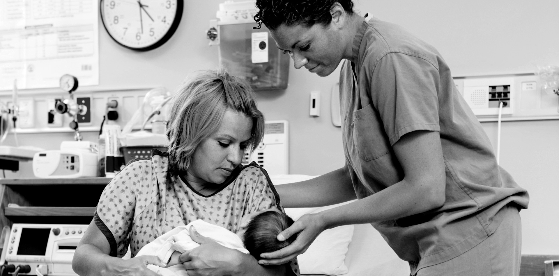
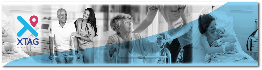
XTAG is a medical devices company based out of the United Kingdom. We were first tasked to create a new identity for the brand which would depict the essence of what the brand stands for. The brand focuses on having a tagging system for a mother and baby, asset tagging and patient tagging. Once we got the brief, we worked on creating a few designs which kept the tagging aspect as the core to create the identity. The location icon attached with the name of the brand and a font typeface which was friendly was what was decided on and thus the rebranding of XTAG was done.

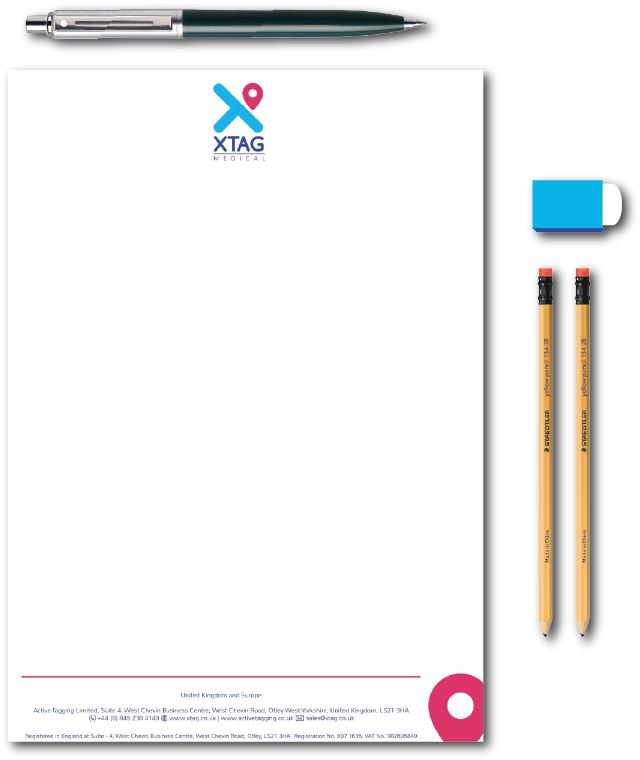
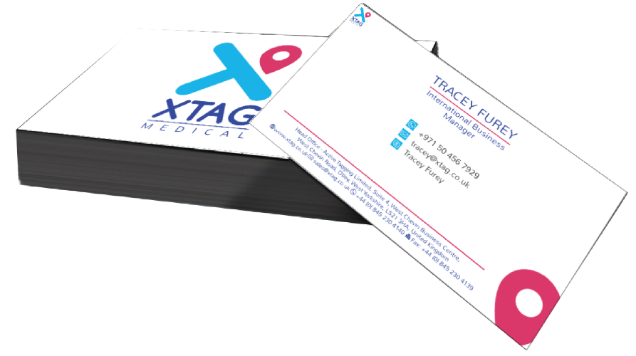
Once the logo was done, we moved onto the other aspects such as business cards, letterheads, quotation templates, signage, signature and presentations. Thus, all their branding across various platforms was achieved. Each of these was designed by keeping the font typeface and the look and feel of the brand in mind.
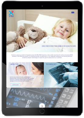
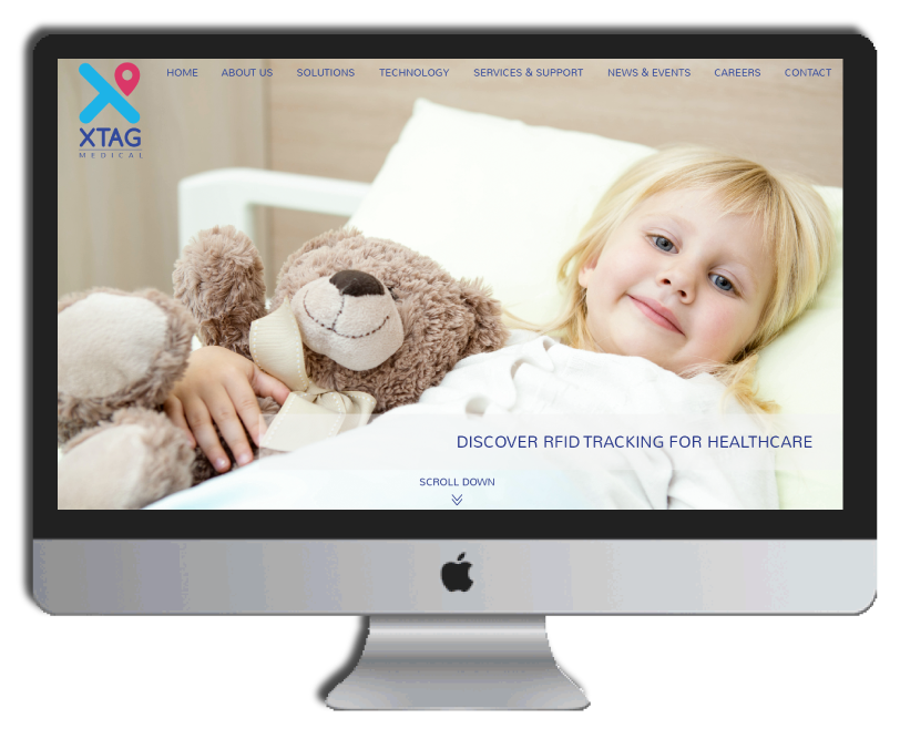
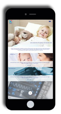
The website which was currently active was old and technologically outdated and thus the brand wanted Tablo Noir to give it a complete revamp keeping the new identity in mind. We created a design which was clean, sophisticated, showcased all that the brand is about and informative. The animations and flow of the website is easy to navigate and is a testament to great UX and UI design.
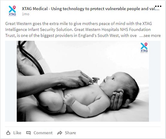
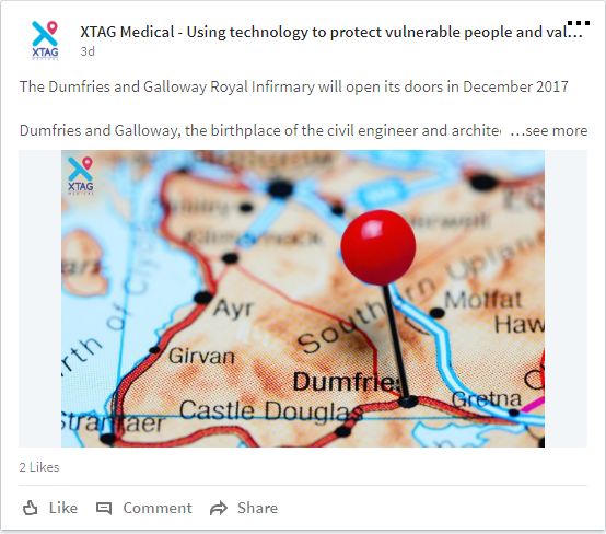
Since the brand is more a B2B one, they wanted to focus on the LinkedIn space for getting the word out in the social arena. Thus, a page was created and updates regarding the brand were put up. The page is slowly seeing traction and all the members of the team and coming in and being a part of the page. We were also tasked to help the core team get their pages cleaned up and be visible on LinkedIn.
Address
Tablo Noir Pvt. Ltd.
2C, Crystal Lawn, 20, Haddow’s Road,
1st St, Nungambakkam,
Chennai- 600006, Tamil Nadu.
